OK, so we’ve all seen (and dig) iconic international albums like The Beatles’ Abbey Road, Joy Division’s Unknown Pleasures, Pink Floyd’s Dark Side of the Moon, Nirvana’s Nevermind, and Madonna’s True Blue, and how they brilliantly reflect the band/artiste’s musical directions. But do our local album covers fare as well? We assess Ronin’s Do or Die, Electrico’s Hip City , Concave Scream’s Horizons and The Observatory’s Blank Walls to find out about if they’re just as good.
Ronin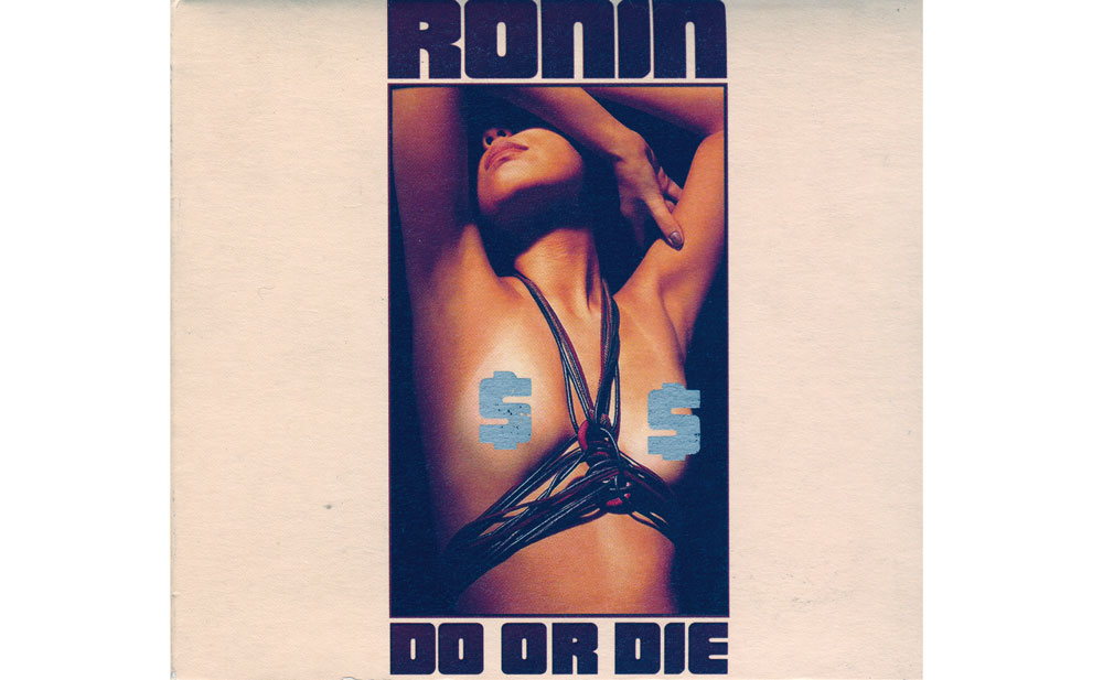 Album Title: Do Or Die
Album cover designed by: Levan Wee (lead singer of Ronin) and Dominic Fernandez, with photos by Yazer Aziz.
Cover Concept: Aiming for a vintage feel, the color scheme and lettering are straight out of the good old days. And get this—the dollar signs on the packaging can be scratched off like a scratch-and-win card to reveal the full glory of the cleavage. It’s a smart way to hide the good stuff.
Music: Straightforward rock music from the ’60s and ’70s.
Does it fit the theme?: Resoundingly so. What better way to showcase ’60s rock ’n’ roll than with a (almost) nude silhouette? Nice.
What we think: The combination of retro and sexy is a hit. Sex sells, and what would sell more than a lasciviously posed, bare female torso on the cover, strategically placed dollar signs the only thing protecting her modesty? Legendary status imminent.
Concave Scream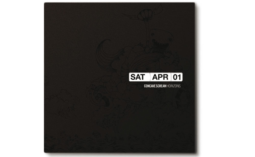 Album Title: Horizons
Album cover designed by: Band members Pann Lim, Sean Lam, Andy Yang and Dean Aziz, who also happen to be advertising designers by day.
Cover Concept: “A living and breathing art piece,” according to Pann. The packaging, together with the CD itself, functions as a working calendar with movable strips, symbolizing the flow of time and hope for the future. Curiously, the liner notes are also designed to be gradually rubbed away with use, “to denote time’s inexorable march.”
Music: Described as alt-rock, you wouldn’t be able to tell the music genre from the deceptively simple cover.
Does it fit the theme?: Much effort has been put in to ensure that we get the temporal theme, and yes, we do.
What we think: A fascinating concept and admirable effort from the band members. Clever thought has been put into the packaging, although it just doesn’t look rock-ish enough. Perhaps too arty for its own good.
Electrico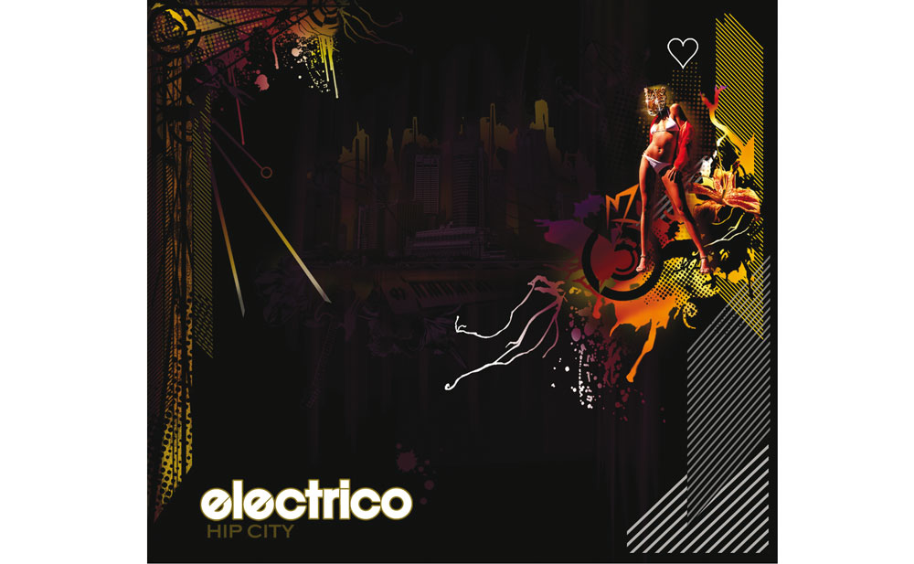 Album Title: Hip City
Album cover designed by: Visual artist and graphic designer Jaz Loh
Cover Concept: The fusion of local structures and buildings with “New Wave colors,” inspired by the band’s new electronic sound, as described by the band’s drummer Desmond Goh—is pretty good. The album’s title refers to Singapore as a hip city, hence the album’s hip styling.
Music: Besides electronica, pop, rock, alternative, jazz and bossa nova influences are also cited by the band, making their musical leanings just as colorful as their album cover.
Does it fit the theme?: Well yes, if we can take Loh’s word for it, that “everything was a deconstruction of literal metaphors from their lyrics.”
What we think: The flashy colors with a Pop Art sensibility stands out enough to attract the casual browser. Our only complain is that it’s not too different from the many other equally shiny album covers out there competing for our attention.
The Observatory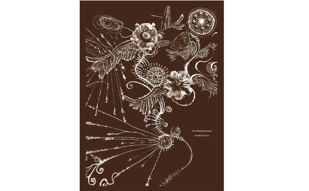 Album Title: Blank Walls
Album cover designed by: Yuen Chee Wai, with illustrations by Andy Yang
Cover Concept: Yuen conceptualized a moody vision of “turmoil that lies beneath the seemingly calm surface,” reflecting the band’s musicality, and “the repulsive and flavorless state of affairs we commune in.” He also admits to feeling “wretched” while designing this. Heavy stuff.
Music: Experimental, deep and abstract.
Does it fit the theme?: Far from being tumultuous, it’s actually quite beautiful, in a gothic sort of way. There’s obviously more to it than random pretty curves, judging from the surreal nature of florid orbs with wings cavorting around—but maybe we’re not deep enough to get it.
What we think: Chic and arty rather than cool, this should appeal to those who appreciate understated style. Quite beautiful, if not for its slight affectedness.
Worst Local Album Covers Ever Taufik / Blessings
Toothpaste commercial gone wrong. Don’t lie on the grass if you want to keep your shiny, clean teeth.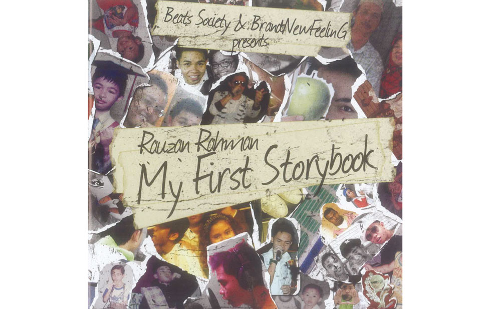 Rauzan Rahman / My First Storybook
A primary school yearbook project? How old is the singer anyway? 12?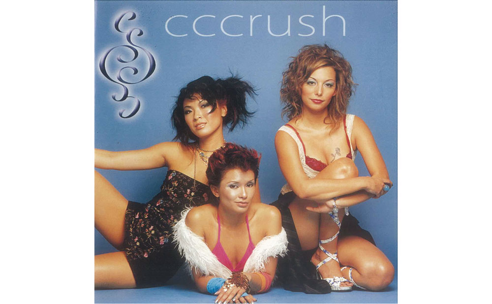 Cccrush / Feel the Move
This cheaply-styled EP cover from shortlived group Cccrush should be cccrushed, alright.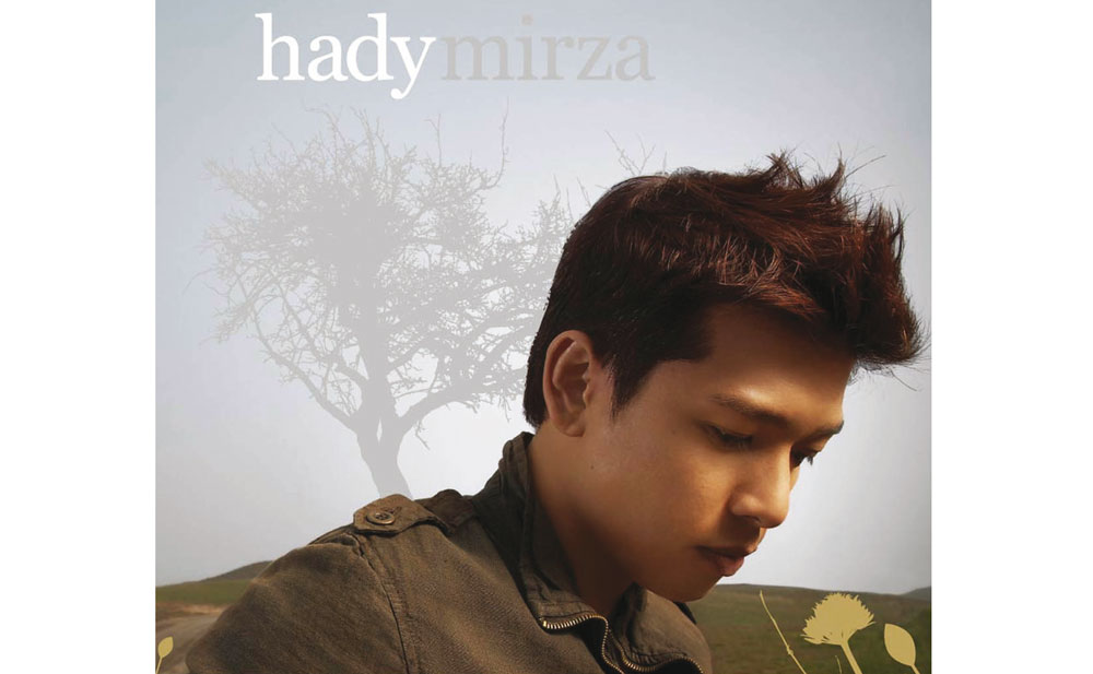 Hady Mirza / Hady Mirza
Booooooooring.