There are many restaurants and bars opening each day in Singapore, but a few stand out by offering an experience beyond just food and drink. Take a closer look at the interiors of these three new dining destinations that satisfy not just your senses of taste and smell.
MO Bar, Mandarin Oriental Singapore
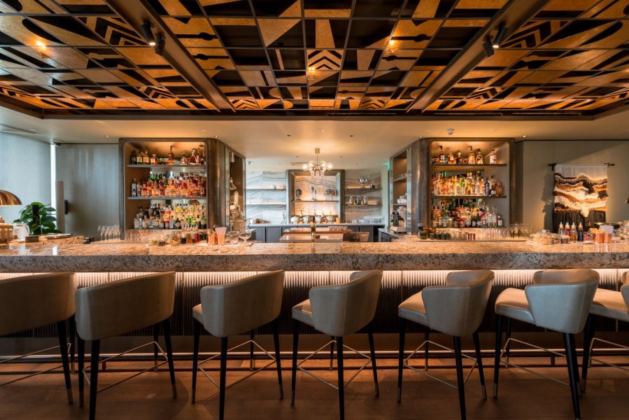
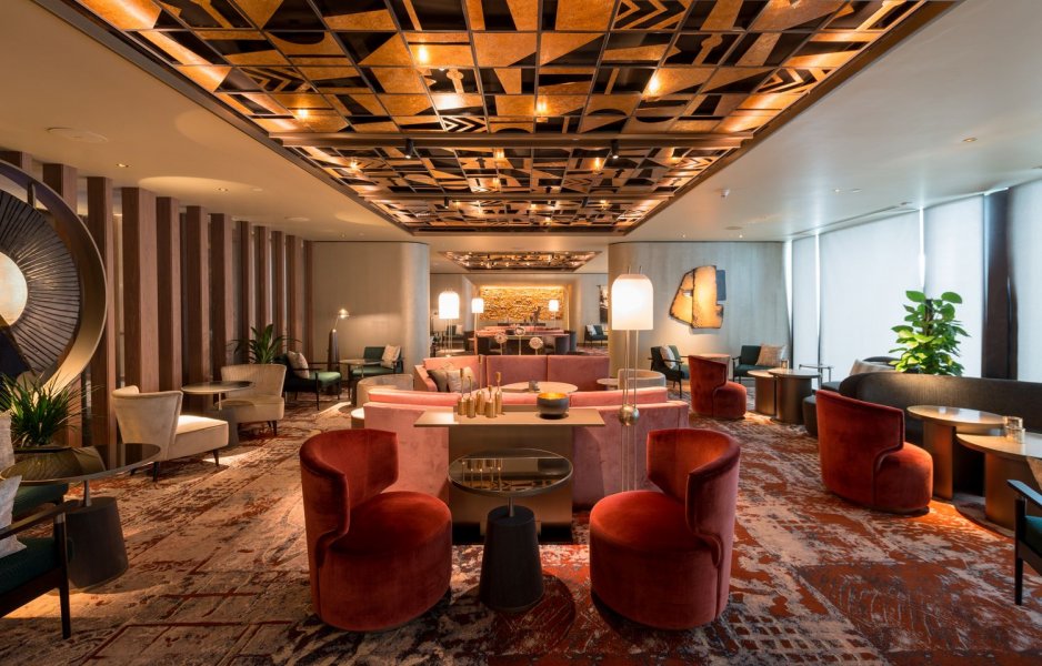
Inspiration comes first: According to a representative from Blueplate Studios, an international design studio that specializes in food and beverage spaces: “We knew that MO Bar would be something special. The hotel was set out to create an experience that would differentiate it from many of the traditionally, often impersonal, hotel bar environments. MO Bar was meant to appeal to the modern nomads that pass through Singapore, while positioning itself as a staple for discerning local local aficionados alike.”
Blueplate Studios’ design process began by developing an in-depth narrative that encapsulated the directives of the brief and gave them enough complexity, and meaningful design parameters for them to extract meaning, and subsequently, breathe life into all layers of the design.
Translating design: For the initial design concept, one of the suggestions was to explore the reinvention of a traditional tiki bar, infused with Mandarin Oriental’s design DNA. Blueplate Studios approached the challenge by exploring relevant port cities to the Mandarin Oriental brand like Hong Kong and Bangkok. They then moved locally to the rich cultural heritage of the Orang Laut and other sea nomad cultures of the region.
The design exercise process illuminated key characteristics: Folklore and tales of the sea, trade and collecting tokens and artifacts, an almost mystical connection to the stars and moon for navigation, as well as a visual language through tattoos and hieroglyphs.
Where food and interiors meet: Blueplate Studios revealed that the F&B menu and design motif were developed simultaneously, where both were derived from a collaborative deep dive research exercise into the characteristics of the traditional sea nomadic cultures and relevant ports that supported them.
Shares Blueplate Studios: “There was not a single meeting with the client that did not involve Executive Chef Mario Cittadini and the beverage experts from Proof and Co.” What resulted then was a collaboration that ensured everything from the cocktail ingredients to the textile selections reinforced a holistic narrative.
Relationship of food and space: “They are inseparable of course,” says Blueplate Studios. “The enjoyment of food is a visceral experience that is deeply personal. The aromas, flavors, and textures of food we love are always enhanced by the lighting, sounds, and tactile interaction of the spaces we inhabit. At MO Bar, the whole experience serves to imprint the memory and connects with us all in its own unique way—simultaneously nostalgic and adventurous, indulgent and nurturing.”
Visit MO Bar at Mandarin Oriental, 5 Raffles Ave.
Esora
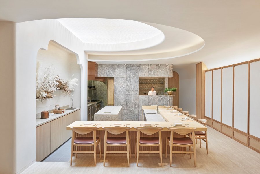
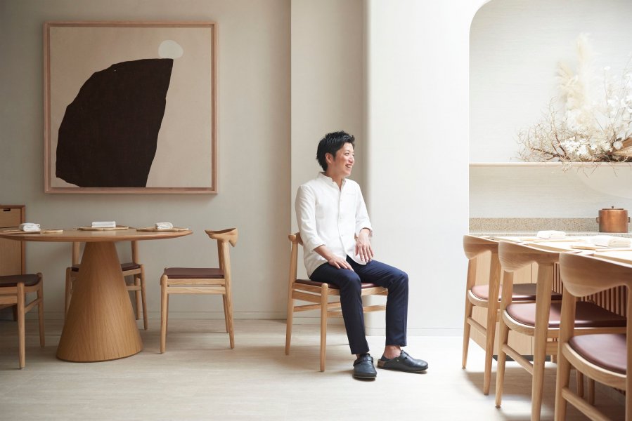
Bringing Esora to life: “The brief for Esora was for a modern Japanese restaurant and the site was a renovated shophouse on Mohamed Sultan Road,” says Marc Webb, Director of Takenouchi Webb. “Through our discussions with Chef Shigeru Koizumi and Lo & Behold, we slowly developed the language of materials and form of the space. As the restaurant was to be centered around the counter/chef’s table, this became the centerpiece of the restaurant.”
The restaurant name means “drawn sky”, so the skylight also became a strong feature of the restaurant’s design. “We very much liked the sunlight the space received, but wanted to moderate the harsh daylight and create a feature of it at night. We used a honeycomb-shaped paper to cover the skylight, creating a cloud-like effect that diffused the light,” reveals Webb.
Do flavors follow form?: “We did try Chef Koizumi’s food,” says Webb, and adds: “but the design developed more from the overall concept of the restaurant being modern Japanese.” The interior’s design has Japanese elements, such as timber screens and panels and back counter wall, but is then balanced with materials not usually found in traditional Japanese restaurants.
Webb reveals that the Japanese elements are modernized, such as the timber grid screens with a shoji paper effect, the back-show kitchen wall that has a stylized tokonoma element, and the plaster with timber panels that line the wall.
Keeping the kappo tradition: At a kappo restaurant, the counter plays an important role that allows for interaction between chefs and diners. “The counter top was imported from Japan and made of Hiba wood from Aomori. This is very much the focus of the restaurant. We didn’t change much of the existing plan, but we did introduce a stepped down area for the chef, so his eye level is closer to the seated guests and creates a sense of intimacy,” says Webb.
A matter of feeling: “We want to evoke the feelings of softness and calmness when diners first walk in,” shares Webb. “We want them to feel like they are in a very contemporary space, but with small Japanese touches. We always want to make comfortable spaces that do not overpower the dining experience and hopefully, create a timeless design.”
Visit Esora at 15 Mohamed Sultan Rd.
Halcyon & Crane
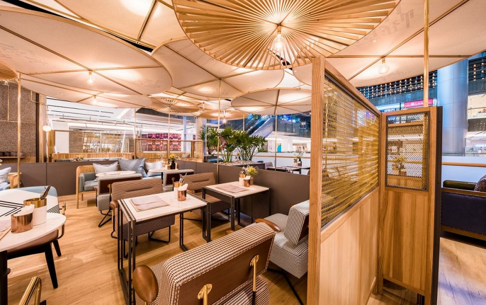
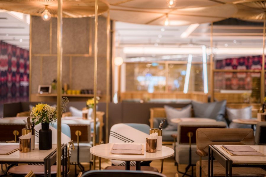
Shades of Sichuan: According to Liu Bin, Director of Halcyon & Crane, the cafe’s main point of inspiration was Sichuan, which has a unique culture and many famous landmarks. “Chengdu is a very relaxed and idyllic city and we wanted to bring that laid back atmosphere into the space—all while aligning with the design guidelines and ambience of The Paragon, of course.”
“We used textures and materials into the cafe design without being too traditional. As an example, wooden umbrellas arranged on the ceiling serve two purposes: Provide shade from the shopping mall’s harsh spotlights, as well as serve as a showcase of traditional Chinese umbrella craft-making. With the addition of artistic Chinese characters, it subtly communicates the important cultural destinations and landmarks of Sichuan.”
What’s more, the city of Chengu is also known as a place with the most number of tea pavilions for residents and visitors to relax. “We wanted to internationalize what this was like and bring this to Singapore, right at the heart of Orchard Road.”
Feels like home: “When we design an environment, one of our design pillars and philosophy is to make it feel like home,” shares Liu. “The main element is to make it relaxed, allowing guests to slow down their pace. However, it is not simply about taking inspiration from a residential home design. Instead, we draw inspiration from our inner design to feel at home; to belong.”
Towards something genuine: “Sometimes, design is done for the sake of design—beautiful, luxurious, and sleek lines,” reveals Liu. “All of that is not difficult to achieve. But the hardest part is how to make a guest feel comfortable within the space. It is not really about how expensive the materials you use are, but it is about bringing out the warmth in your heart.”
At Halcyon & Crane, not only can guests look forwards to a delicious meal, but also the chance to sit down, relax, and feel that the moment belongs to them.
Visit Halcyon & Crane at The Paragon, #03-09, 290 Orchard Rd.
A version of this story first appeared on Portfolio as Feast For The Senses.


